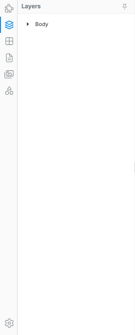
Layers
The Layers tab shows the real hierarchy of the current page. Use it when the canvas is not precise enough: hidden elements, covered images, nested rows and columns, empty containers, symbol instances, and small elements with no visible padding are all easier to target from Layers.
Select covered or hidden elements
Section titled “Select covered or hidden elements”Some elements are difficult or impossible to click directly on the canvas. For example, a header image can sit underneath an overlay, or a nested container can have no obvious padding around it.
- Open the Layers tab in the left sidebar.
- Expand the parent section using the caret.
- Click the layer row for the exact element you want.
- Use the right sidebar to edit its Design or Settings.
Verify the hierarchy level
Section titled “Verify the hierarchy level”Before changing layout styles or creating a symbol, confirm that the selected layer is the level you actually mean to edit:
- Container — usually controls section width and outer spacing.
- Row — usually controls horizontal grouping.
- Column — usually controls responsive span, order, and column-specific alignment.
- Content element — text, image, button, icon, card, or media inside the layout.
This matters because the same visual area can contain several nested elements. If you style a Column when you meant to style a Button, or create a symbol from a Row when you meant to reuse the whole section, the result will feel wrong even though the canvas selection looked close.
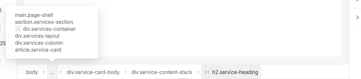
Use the canvas breadcrumb
Section titled “Use the canvas breadcrumb”When you select something on the canvas, Swebsy shows a breadcrumb along the bottom of the canvas area. It mirrors the same hierarchy you see in Layers, but keeps it close to the canvas so you can confirm the exact selected element without switching panels.

Use the breadcrumb when you need to:
- Check whether you selected text, a button, a card, a column, or the whole section.
- Click a parent crumb to move selection up one level before styling or moving it.
- Confirm the current hierarchy while the Layers tab is closed.
For deeply nested elements, the middle of the path collapses behind an ellipsis. Open the ellipsis to select a hidden ancestor directly.
Move and nest with Layers
Section titled “Move and nest with Layers”Drag a layer row to move it. Drop between rows to reorder siblings, or drop inside a row that can accept children, such as a Container, Row, Column, or Card.

Use Layers for moves where canvas drag is hard to aim, especially inside dense layouts.
Select multiple components
Section titled “Select multiple components”Hold Shift and click additional layer rows to build a multi-selection. Each clicked row is added to or removed from the current selection.
You can use a multi-selection to:
- Move a group of siblings at once by dragging any selected row.
- Wrap the selection in a new container with Ctrl+G (see below).
Group and ungroup
Section titled “Group and ungroup”Grouping wraps selected components in a new div container so you can style, move, or animate them together. Ungrouping promotes children out of the container and deletes the wrapper.
Group: Ctrl+G / Cmd+G
Section titled “Group: Ctrl+G / Cmd+G”Select two or more layer rows that share the same parent (hold Shift and click).
- Press Ctrl+G (Windows / Linux) or Cmd+G (Mac).
Grouping a single component is also valid — it wraps the element in a new div
that you can style independently (useful for adding padding, a border, or a
background to an otherwise unstyleable element).
Ungroup: Ctrl+Shift+G / Cmd+Shift+G
Section titled “Ungroup: Ctrl+Shift+G / Cmd+Shift+G”- Select the wrapper layer you want to dissolve.
- Press Ctrl+Shift+G (Windows / Linux) or Cmd+Shift+G (Mac).
Both operations are a single undo step: Ctrl+Z / Cmd+Z fully restores the original structure.
Hide, show, and lock layers
Section titled “Hide, show, and lock layers”Hover a layer row to reveal row actions:
- Eye — hide or show the layer while you work.
- Lock — prevent accidental editing or movement.
Hidden layers remain in the page structure. They are useful while editing overlapping content, but they are not deleted.

Rename layers
Section titled “Rename layers”Double-click a layer name to rename it. Good names make complex pages much easier to manage, especially when you have repeated Containers, Rows, Columns, and symbol instances.
Use names like:
Hero imageHeader overlayPrimary CTA rowPricing card groupFooter links column
Layers and Symbols
Section titled “Layers and Symbols”Layers is the safest place to confirm what you are turning into a Symbol. Select the exact parent layer first, then create the symbol from the Symbols tab.
For example:
- Select a full footer Container to create a reusable site footer.
- Select a single Button to create a reusable CTA button.
- Select a Card Group if the full repeated group should stay synced.
- Select one Card if each card instance should be reused separately.
Symbol instances show a badge in the Layers panel so you can spot reusable content while inspecting the page hierarchy.
I clicked the canvas but selected the wrong element — open Layers and select the exact row. This is common with overlays, nested grids, and elements with no visible spacing.
I styled the wrong level — check whether the selected row is a Container, Row, Column, or content element before changing Design controls.
A layer will not drop inside another layer — not every component accepts children. Drop inside layout/content containers such as Container, Row, Column, or Card, or drop between siblings instead.
I cannot see the row actions — hover the layer row. The lock and visibility buttons appear on the right side of the row.
Ctrl+G did nothing — make sure all selected components share the same parent. If they come from different parent containers, the group operation is blocked. Select siblings within a single Row, Column, or Container.
Ctrl+Shift+G removed my wrapper’s styles — ungrouping deletes the wrapper div, including all classes on it. Press Ctrl+Z / Cmd+Z immediately to restore the previous state. If you want to keep the styles, move them to a child element before ungrouping.
I accidentally grouped into the wrong level — press Ctrl+Z to undo. The group operation creates a single undo step, so one undo fully reverses it.