Dark mode
Dark mode lets you design the version of your site visitors see when their browser, operating system, or on-page theme switch resolves to dark. In Swebsy, you preview that dark version on the canvas, adjust global dark color tokens for the whole site, and add element-level overrides where a specific section needs better contrast.
This page covers how to preview dark mode while editing, how those edits are saved, and how to add a visitor-facing dark/light switch to the published site.
Preview the site in dark mode
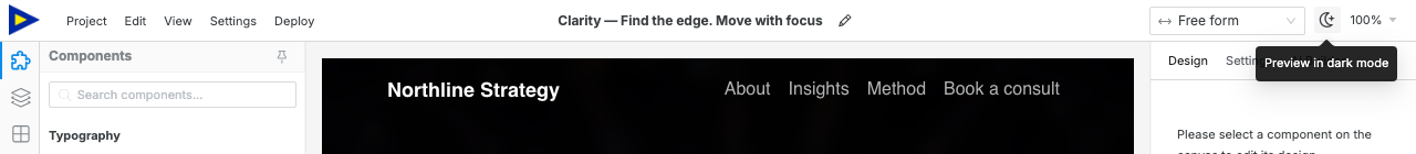
Section titled “Preview the site in dark mode”The fastest option is the dark/light icon beside the responsive device selector in the topbar. Click it to toggle the canvas between site light preview and site dark preview.
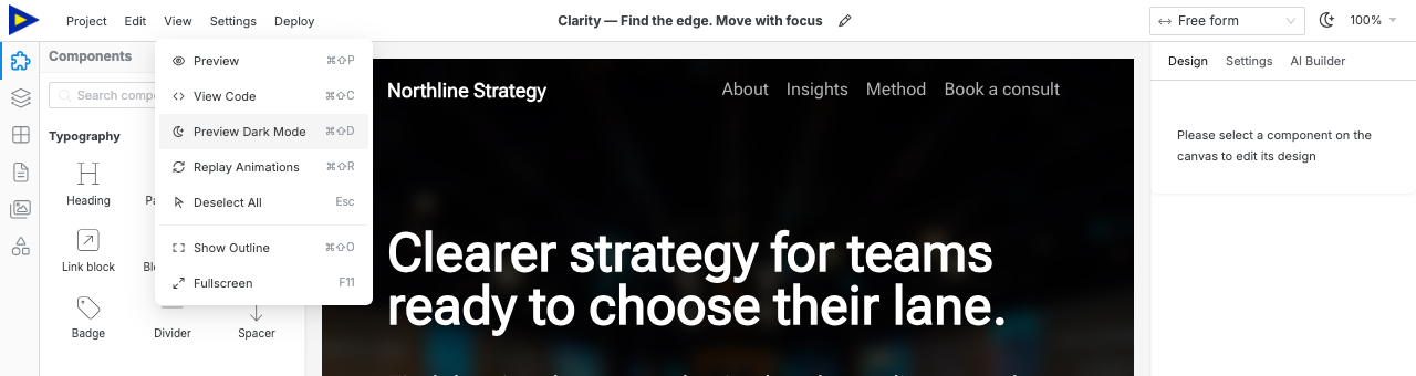
You can also use the View menu:
- Open View in the topbar.
- Choose Preview Dark Mode.
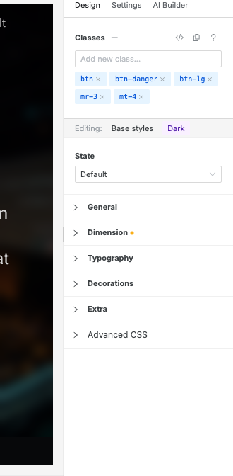
- Select an element on the canvas.
- Open the Design tab.
- Confirm the Design panel shows the Dark editing ribbon.
The View menu is another way to toggle the same site dark preview. After dark preview is active, the menu item changes to Preview Light Mode.
Style dark-mode overrides
Section titled “Style dark-mode overrides”While the canvas is in dark preview mode, use the Design panel to tune supported visual properties.
Good dark-mode overrides include:
- text color
- background color
- border color
- shadow
Keep layout, spacing, and sizing shared unless the dark design genuinely needs a different structure. Dark mode should usually change color and contrast, not the page layout.
Read Design panel for how dark mode combines with responsive breakpoints and hover/focus states.
Set global dark colors
Section titled “Set global dark colors”Use Settings → Theme → Colors to configure site-wide dark color tokens. Global dark tokens are best for the overall color system: backgrounds, text, brand colors, borders, and semantic colors.
Use element-level Design overrides only when one section or component needs a special dark-mode treatment.
Add a visitor-facing dark/light switch
Section titled “Add a visitor-facing dark/light switch”The topbar dark preview control is for editing. Visitors need a component on the page if you want them to switch modes themselves.
- Open the Components tab.
- Find Dark/Light in the Interactive category.
- Drag it onto the canvas, usually into the navbar or footer.
- Select it and open the Settings tab.
- Set Default Mode to System, Light, or Dark.
The Dark/Light component renders a visitor-facing three-way switch:
| Mode | Visitor experience |
|---|---|
| System | Follows the visitor’s operating-system color preference. |
| Light | Starts the page in light mode. |
| Dark | Starts the page in dark mode. |
Test the component in Preview mode or in the exported/deployed site.
The editor turned dark but my site did not — you changed Preferences → App Theme. That setting belongs to App preferences. Use the topbar dark/light preview icon or View → Preview Dark Mode to edit the site.
Dark-mode colors are not saved — select an element, switch the canvas to dark preview mode, then confirm the Design panel shows Dark before editing.
The published site has no switch — add the Dark/Light component from the Interactive category. The topbar preview control is not part of the page.
Dark mode looks inconsistent — set global dark color tokens first, then use Design overrides only for sections that need special treatment.