Responsive editing
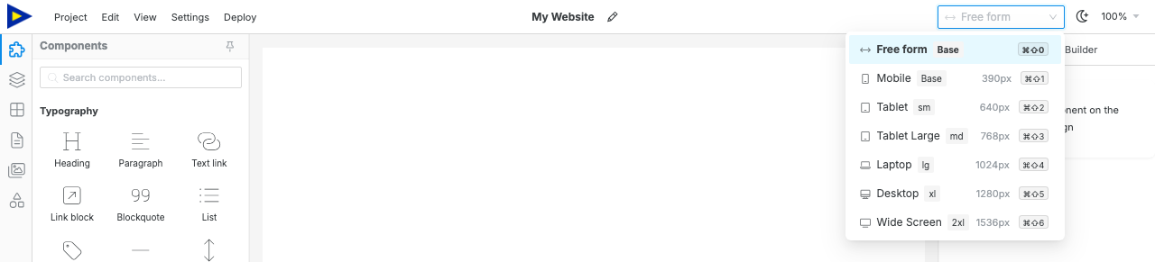
Swebsy uses the device selector in the topbar to preview the canvas at common viewport widths. Use it while editing so layout changes are checked before you export or deploy.
Check each device size
Section titled “Check each device size”- Open the device selector in the topbar.
Start with Free form or Mobile. They both edit the base mobile styles.
Switch upward through Tablet, Laptop, Desktop, and Wide Screen.
Scroll through the page and check spacing, text wrapping, and images.
- Use Preview mode for the final check without editor overlays.

Responsive style controls
Section titled “Responsive style controls”Some design controls are breakpoint-aware. Because Swebsy is mobile-first, changes made in Free form or Mobile become the base styles. When a larger device is active, changes made in the right sidebar can apply only from that breakpoint upward without changing the smaller mobile layout.
The Design panel shows the active editing context so you can tell whether a change is being made to base styles or to a breakpoint override.
Use this for practical fixes:
- reduce large spacing on mobile
- stack columns that are too narrow
- resize oversized headings
- adjust image fit or alignment
- hide non-essential decorative elements
Export checklist
Section titled “Export checklist”Before export or deploy:
- Check desktop, tablet, and mobile.
- Open Preview mode and scroll the whole page.
- Test navigation links and buttons.
- Confirm no text is clipped or hidden behind another element.
Mobile layout still looks like desktop — check that the selected component uses responsive layout controls, such as columns or flex settings, instead of a fixed width.
Text wraps awkwardly — reduce font size or spacing at the active breakpoint, or make the container wider.
Preview and editor look slightly different — editor outlines and selection handles are removed in Preview mode. Use Preview for the final visual check.