Theme tokens
Theme tokens are site-wide design variables. Changing a token updates every component that uses it — you don’t need to restyle individual blocks.
Open the theme panel
Section titled “Open the theme panel”- Click Settings in the topbar.
- Click Theme in the dropdown menu.
- The Site Settings modal opens to the theme editor, which has four tabs: Colors, Typography, Animation, and Advanced.
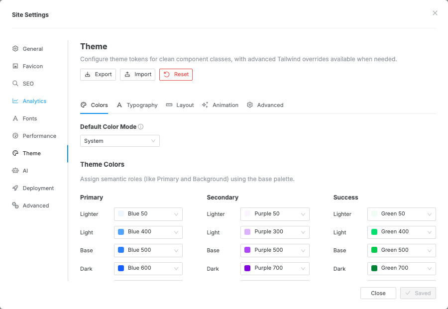
Colors
Section titled “Colors”The Colors tab has four sections:
- Default Color Mode — sets whether the site loads in System (follows the visitor’s OS preference), Light, or Dark mode.
- Theme Colors — assign semantic roles (Primary, Secondary, Background, Text, etc.) to shades from the base palette. These drive utilities like
bg-primaryandtext-defaultacross every component. - Dark Mode Colors — override semantic colors for dark mode. These values are used when the exported site resolves to dark mode.
- Base Colors — override individual Tailwind color shades (e.g. change what
blue-500looks like globally).
Change a color
Section titled “Change a color”- Open the Colors tab.
- To change a semantic role (e.g. Primary, Background): find it in Theme Colors and choose a shade from the dropdown.
- To edit a raw palette color (e.g.
blue-500): scroll to Base Colors, click the swatch, and pick a color or enter a hex / CSS value. - Click Save in the modal footer.

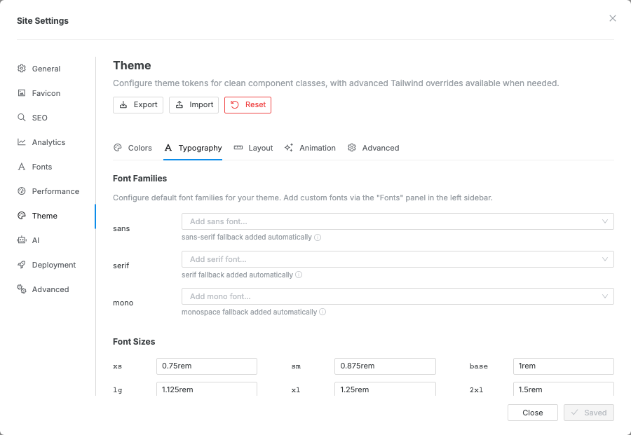
Typography
Section titled “Typography”The Typography tab controls:
| Setting | What it controls |
|---|---|
| Font family (sans / serif / mono) | Base font for body text, headings, and code |
| Font size scale (xs → 9xl) | The responsive type scale used by all text components |
| Font weights | Available weight steps (light → bold) |
| Line height | Tight / normal / relaxed variants |
To use a custom or Google Font, add it in Settings → Fonts first, then select it here.
Animation
Section titled “Animation”Site-wide animation defaults. See the Animation guide for details.
For element-level dark-mode overrides and the visitor-facing dark/light switch, see the Dark mode guide.
Advanced
Section titled “Advanced”For advanced users: paste custom design rules here to extend or override anything not available through the UI panels above.
Color change doesn’t appear on the canvas — make sure you clicked Save. Changes are not applied live; they take effect after saving.
Custom font not available in the font family picker — add the font via Settings → Fonts first, then reopen Settings → Theme and select it in the Typography tab.