

Backgrounds
Use Design → Fill → Background to build an element’s background from a solid base color and an ordered stack of gradients, patterns, or images. Existing background colors and images continue to work and can be combined with the newer fill types.
The panel lists the background the way it paints, top first. Background layers come first, with the first layer at the top of the stack, and the solid color sits last, at the bottom, where it paints.
Add a background
Section titled “Add a background”- Select the section, container, or other element you want to style.
- Open the Design tab in the right sidebar.
- Expand Fill.
Choose the solid color at the bottom of Background, or click the + beside Background to add a Gradient, Pattern, or Image layer.
- Edit the selected layer and check the result on the canvas.
Set the solid background color
Section titled “Set the solid background color”The color control at the bottom of Background sets the base
background-color. Choose a semantic color from Theme to keep the fill
connected to your site’s design intent, choose an exact shade from Palette,
or choose Custom for a one-off value. The same
swatch picker is used for gradient
stops and pattern colors, and its gear button opens Settings → Theme.
A solid color remains useful when layers are present:
- transparent areas in a gradient or pattern reveal it
- an image that fails to load still has a deliberate fallback surface
- blend modes combine layers with the color underneath
Background color supports the active responsive breakpoint, state, and dark-mode editing context. For example, you can use a light base color normally and a dark base color while the canvas is in dark preview.
Work with the layer stack
Section titled “Work with the layer stack”Each layer row includes a preview swatch, its type, and controls for ordering or deleting it:
| Control | What it does |
|---|---|
| Click a layer row | Selects that layer and opens its editor below the stack. |
| Type menu | Changes an existing layer between Gradient, Pattern, and Image. |
| Up and down arrows | Moves the layer toward the front or back of the background stack. |
| Trash | Removes only that layer. The solid color and other layers remain. |
| − beside Background | Clears the background layers and solid color in the active context. |
New layers are added at the top of the stack. Because the first layer is painted in front, an opaque image or gradient can hide layers below it. Reorder the stack or introduce transparency when you want the layers to combine.
Photos and overlays behind a section
Section titled “Photos and overlays behind a section”Many templates put a photo behind a section’s content, often with a dark overlay on top so the text stays readable. These are separate elements inside the section, not part of its own background, so changing the section’s color alone wouldn’t show.
When you select a section like that, Background lists them at the top, in the order you see them (the one in front first):
- Overlay — a swatch and its color by name, such as Stone 950 · 50%.
- Image or Video — a thumbnail and its alt text.
From each row you can:
- Click the overlay’s swatch to change its color and opacity right there, without leaving the section. The change applies at the screen size, mode and state you’re editing, and Undo takes it back in one step.
- Click the photo’s thumbnail to replace it with another photo from your assets. The photo’s styling stays as it is; update its alt text in Settings if the new photo shows something else.
- Click the name to select that photo or overlay, so the whole Design panel edits it.
- Remove it with the bin that appears when you point at the row. Undo brings it back.
The section’s own color is the last row; click it to change it. When a photo or video covers it, the row is dimmed, and pointing at it says Hidden under the image above, so you know a change there won’t show until the photo is gone.
Create gradients
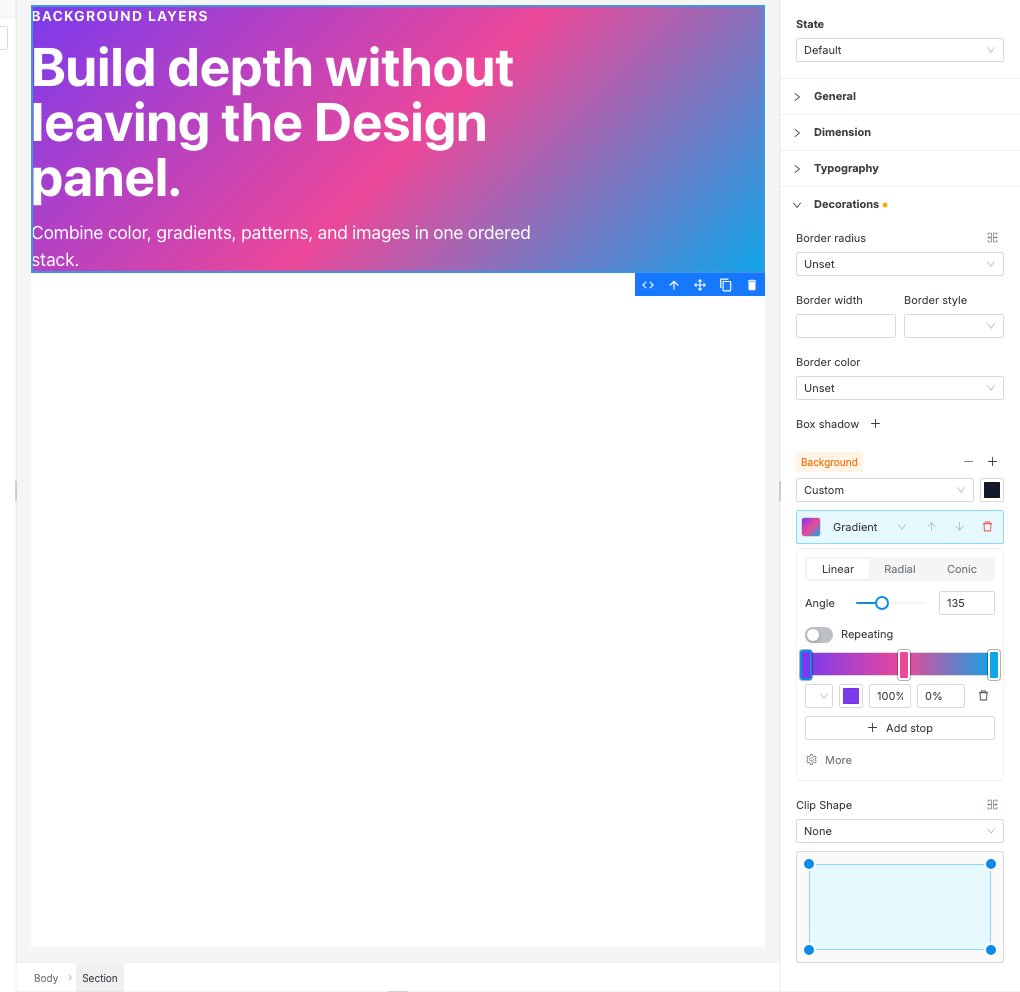
Section titled “Create gradients”Add a Gradient layer, then choose one of three gradient types:
| Type | Options |
|---|---|
| Linear | Set the angle from 0–360°. |
| Radial | Choose Circle or Ellipse, then drag the focal point to set its center. |
| Conic | Set the angle and drag the focal point to position the gradient’s center. |
Turn on Repeating to repeat the gradient instead of stretching it once across the element.
Edit gradient color stops
Section titled “Edit gradient color stops”Every gradient starts with at least two color stops. You can:
- click a stop marker to select it
- drag a marker along the preview bar, or enter its 0–100% position
- select a theme color or custom color for the active stop
- click an empty part of the preview bar to insert a stop there
- click Add stop to add another stop
- delete a selected stop when the gradient has more than two
Theme colors are especially useful for gradients because the layer can follow changes to the site’s palette instead of storing only fixed hex values.
Add patterns
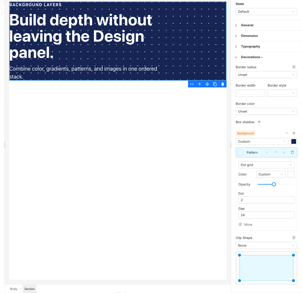
Section titled “Add patterns”Add a Pattern layer and choose a preset. Pattern colors can use theme colors or a custom value.
| Preset | Available controls |
|---|---|
| Dot grid | Color, opacity, dot size, and gap |
| Stripes | Color, opacity, angle, and stripe width |
| Grid lines | Color, opacity, line thickness, and gap |
| Checkerboard | Color, opacity, and tile size |
Pattern opacity affects the marks, not the element’s entire background. This lets the solid color, gradient, image, or other layer beneath it remain visible.
Use a background image
Section titled “Use a background image”Add an Image layer and click Select image to open the asset picker. Choose an existing image or upload one first from the Assets tab. After an image is selected, use Change to replace it without rebuilding the layer.
The image layer preserves Swebsy’s existing background-image workflow. It also gains the same position, repeat, attachment, size, and blend controls used by other background layers.
Handle existing unsupported CSS
Section titled “Handle existing unsupported CSS”Swebsy preserves existing background-image values that the visual editors
cannot recognize. These appear as Unsupported CSS layers instead of an
editable background type. Switch the layer to Gradient, Pattern, or
Image to replace it, or remove the layer.
A compound background shorthand that cannot be split safely appears under a
Legacy background shorthand warning. Edit or clear that raw value before
using structured background layers.
To add a new advanced background effect with CSS, use Settings → Advanced → Custom CSS instead of the Background layer menu.
Open the More controls
Section titled “Open the More controls”Select a layer and click More to adjust how it is painted:
| Control | Options and behavior |
|---|---|
| Repeat | no-repeat, repeat, repeat-x, repeat-y, space, or round |
| Position | Center, an edge, or one of the four corners |
| Attachment | scroll, fixed, or local |
| Size | A CSS size such as auto, cover, contain, or another valid value |
| Blend | Normal plus Multiply, Screen, Overlay, Darken, Lighten, and other blend modes |
Size appears for gradients and images. Pattern presets calculate their own size from controls such as Gap or Size, so they do not show a separate Size field.
The full Blend list is Normal, Multiply, Screen, Overlay, Darken, Lighten, Color Dodge, Difference, Exclusion, Hue, Saturation, Color, and Luminosity.
Edit multiple elements or inherited backgrounds
Section titled “Edit multiple elements or inherited backgrounds”When a background comes from a smaller breakpoint or the default state, the label shows inherited. Editing it creates a background stack for the active breakpoint/state; clearing that override reveals the inherited background again.
When selected elements have different backgrounds, the panel shows mixed. Editing a layer applies the resulting stack to every selected element.
I changed the background color but nothing changed — a photo covers the section. The color is dimmed when that’s the case: replace the photo, recolor its overlay from the overlay’s swatch, or remove the photo.
A lower layer is not visible — the layers above it are opaque. Move the layer upward, add transparency to the upper layer, or use a blend mode.
The pattern is too strong — reduce the pattern’s Opacity. This changes the pattern marks without fading the content or solid color.
A background image is cropped — open More and change Size to contain,
or adjust Position. Use cover when filling the whole surface matters more than
showing the complete image.
A fixed background does not look fixed in the editor — test it in Preview mode or on the exported site. Editor canvas scrolling is separate from page scrolling.
Changing the gradient in dark preview also changed light mode — layer stacks are shared between light and dark. Use theme-aware stop colors so the gradient adapts, or use the CSS under Advanced for separate dark-mode layer values.
The panel says Legacy background shorthand — the existing background
value combines several CSS properties in a form the structured editor cannot
safely split. Edit or clear the raw value before adding structured layers.