

Build a waitlist landing page that collects submissions
A waitlist page does two things. It tells people why they might want your product, and it gives them a way to say “I’m in” that actually works. A pretty form that never delivers a signup is doing half the job.
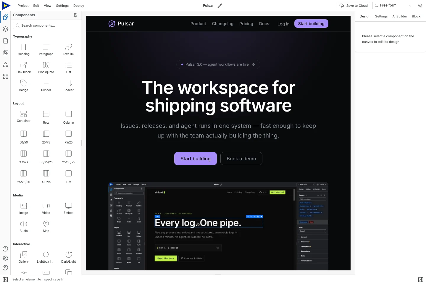
We’ll start with Pulsar and strip it down to one action. The product claims, quotes, logos and prices in it are all examples. Replace them with your own evidence, or delete them.
Pick where signups go first
Section titled “Pick where signups go first”Decide this before you design anything:
| Where the site runs | What receives the form |
|---|---|
| Swebsy Hosting, including a domain connected to it | Swebsy Forms, within the applicable paid plan or trial |
| Your own static host | An external HTTPS form endpoint you configure |
| A local exported preview | A test endpoint, or a link to a separate hosted signup page |
The free builder makes and exports the page. Collecting, delivering and keeping submissions is a separate thing. Check forms and plans for the current terms. An external provider has its own setup and costs.
A basic waitlist stores “I’m interested”. That’s it. Referral leaderboards, invite queues, double opt-in and email campaigns all need more than an email field, so don’t promise them.
1. Write an offer people can judge
Section titled “1. Write an offer people can judge”Put the audience, the problem and the result on the first screen. Something like:
A shared handover workspace for small support teams. Join the waitlist to hear when the first version is ready.
That one’s made up for this guide. For yours, say whether the product exists yet, what joining means, and what they’ll hear from you. A waitlist isn’t access, so don’t make it sound like it is.
Only show a screenshot if it’s what the product really looks like. If it’s a mockup, say so. No visuals yet? A short “here’s how it’ll work” beats a fake dashboard.
2. Keep it short
Section titled “2. Keep it short”Four sections are plenty:
- Offer: who it’s for and what problem it solves.
- Explanation: what the first version should do.
- Signup: the form, plus what happens after they submit.
- Questions: availability, how often you’ll email, and any real limits.
Cut pricing tables, customer counts and testimonials you can’t back up. A link to a real demo is fine if it helps people understand the offer.
3. Add a small form with real labels
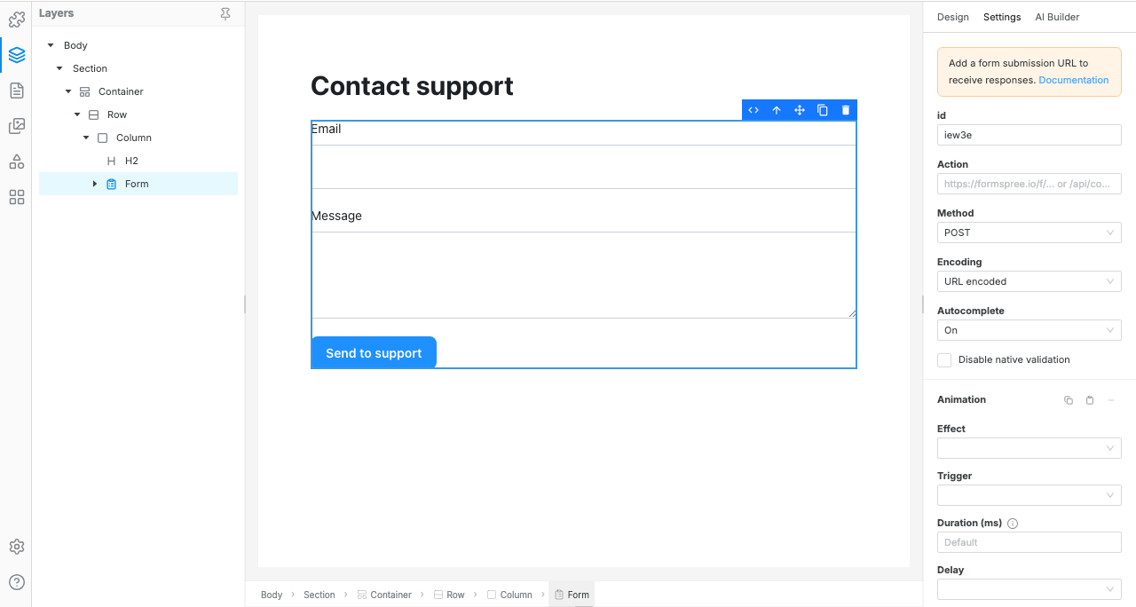
Section titled “3. Add a small form with real labels”Open Blocks and search for a form block. Select the form itself in Layers. Clicking around it on the canvas often grabs the container instead.
Start with email. Add one optional question, like “What do you use today?”, only if you’ll actually read the answers. Every field gets a visible label and a stable Name. Make the email field the email input type, and required.
Label the button “Join the waitlist”, not “Submit”. People should know what they’re clicking.
4. Connect the destination
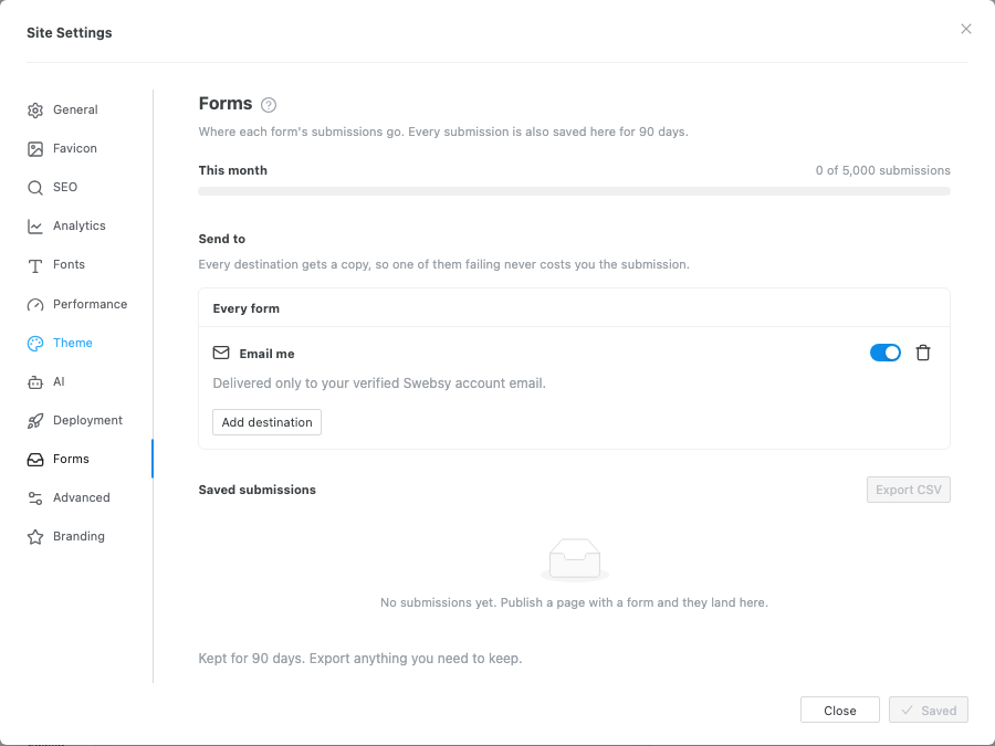
Section titled “4. Connect the destination”On Swebsy Hosting, keep Submissions → Collect with Swebsy, give the form a name you’ll recognize, like “Product waitlist”, and set where it goes in Settings → Forms.
On external hosting, choose Post to my own URL and paste the provider’s HTTPS endpoint. Set the method and encoding to whatever the provider expects, and follow its official instructions. An endpoint that wants JSON won’t necessarily accept a normal form post.
Never put a private email-service API key in a page, a URL or exported JavaScript. And don’t ship with an example endpoint still in there.
5. Say what happens next
Section titled “5. Say what happens next”Use a short message or a thank-you page. Say what you got and what happens now:
Thanks for your interest. Your details have been submitted. We will contact you when the first version is available.
Only say “we sent you an email” if something actually sends one. Link back to the product page. Keep error messages visible, so a failed signup never looks like it worked.
6. Test the live page
Section titled “6. Test the live page”You set the form up in the editor. You find out if it works on the live page.
Use test details you control and check:
- Empty required fields block the submit, with an error that makes sense.
- A bad email address gets a proper validation message.
- A good submission reaches the right place.
- The success message or thank-you page shows up.
- You can tell a real submission from a retry.
- On a phone, you can reach the fields and button without scrolling sideways.
A success animation proves nothing. Check the receiving end. Delete your test submission afterwards if it matters.
Before you share the link
Section titled “Before you share the link”Check the page title, description and social preview. Replace any leftover template links. If you move domains or hosts later, test the form again.
Visitors showing up but not signing up? Look at whether the offer is clear and believable before you add fields or effects. This guide gets you a working signup flow. It can’t promise how many people use it.